The Evolution Of The Medium Logo: A Brief History
![]()
Much like the platform itself, the Medium logo has undergone plenty of changes since its 2012 inception.
In recent times, Medium has decided to move away from curation. Goodbye to those glorious “congratulations, your article has been curated in …” and hello to the “chosen for further distribution” message on your article’s stats page.
I have to say, while I was slightly opposed to the changes when first announced, I’ve since become accustomed to them. I used to wait for that curation email desperately, and it would bother me far too much if it were either delayed or didn’t arrive at all. Sure, getting your articles curated is still very important if you want to succeed on the platform, but it isn’t paramount.
Instead, Medium pushes its writers to grow relationships with their followers with a more “relational” distribution model. You can personalize your page with colors, logos, and fonts - as can publications.
The logo has changed a lot over the years, and due to the unpredictability of Medium’s management, it stands to reason the recent changes won’t be the last. More on that later.
2012- 2015: The Beginning
Twitter and Blogger co-founder Ev Williams created Medium in 2012. Twitter’s 140 characters allowed writers to express themselves in the short form, while Blogger was long-form. Medium was, well, medium form. I wonder where the inspiration for the name came from.
Anyway, as things were getting up and running, this logo felt like a bit of a placeholder. Take a look:
![]()
This is more of a Medium icon than anything else. While it’s bold, it’s a bit basic. Medium themselves had this to say about it:
“While simple, elegant, and strong, this Stag M proved rather inflexible as a logo. It served us well through our first few years, but as Medium has grown and evolved, the logo has begun to feel flat, impenetrable, blunt, and not to be toyed with. It is also not particularly distinctive, either. In short, our M no longer captured or conveyed what Medium has become.”
During these years, Medium was getting their platform up and running, so it’s perhaps understanding they went for something basic, to begin with.
Looking For Change
By this point, the medium.com logo needs updating. So, what do you do? Here’s what the company had to say:
“We set out this summer with the goal of creating a logo that was a better reflection of who we are, and where we want to head from here. After exploring about a million different ideas for a new icon, we arrived back at the capital M as a visual mark we wanted to hold onto. Next step: we started having some fun — figuring out how an M shape could bend and stretch to embody what Medium felt like to us.”
Here’s what some initial ideas looked like:
![]()
They worked with type designer Rod Cavazosm so, in their words, they could pursue “the concept that our logo could be made of a series of interconnected ideas or shapes that, when joined together, form a new thought. A logo that flows, unfurls, and builds like a great and memorable conversation.”
2015 - 2017: Exploring The Brand
After much deliberation, the Medium blog logo task force settled on a new design:
![]()
Eventually, they settled on a green M and a new font:
![]()
Here’s what they said about the process:
“This simple geometric interpretation of the M felt fun — like a delightful game or a deeply satisfying puzzle. We couldn’t stop ourselves from playing with all the different treatments, mutations, and color combinations it was practically begging for.”
The new green Medium icon is vastly different from the previous stoic-looking edition and represents a changing, experimental time at the company.
At this stage, Medium had begun its Partner Program, but not as we know. Medium only invited a select few writers, so it was an exclusive club.
Moreover, to capitalize on their 140% increase in unique customers during 2016 (60 million from 25 million the year before), the company introduced the $5 membership fee, which still stands firm today.
2017-2020: Growing Up
It appears the previous logo wasn’t performing as hoped because, after 2017, Medium reverted to its original bold identity.
I’m not a massive fan of the green M, nor do I like the font. It’s trying too hard to be something it’s not and comes across as slightly cheap. Medium recognized this and went with a more bold, authoritative font.
![]()
That’s more like it. The new logo gives Medium more editorial prowess - it looks like it would be comfortable next to The New York Times and The Atlantic, for example. Here’s what a branding expert said about it:
“The first success is that the logo now works in black and white (that’s logo design 101 passed). The second is that it honors the history of the brand — if a company this young can be said to have a history — without being a slave to it. The third is that the exaggerated contrast calls to mind the blackletter mastheads of credible publications like the New York Times, or the Washington Post, without actually embracing blackletter — it would be a foolhardy publication that adopted a blackletter masthead, with all its cultural connotations, in the current political climate.”
Put differently: it’s more serious but not as much as the big boys. It’s still for the people.
images:
Medium didn’t stop there. To with the new logo, they released a monogram, which is the uppercase M reversed on a black background:
![]()
Look familiar? The monogram allows flexibility, as it’s useful for social media and gives the writer center stage.
2020 - Present Day: A New Chapter
It seems Medium has found its groove, as shown when you compare the new logo to the old:
![]()
Not much difference, but enough. Here’s what they said:
“For the wordmark itself, not much has changed. We loved our old Medium logo. It felt accessible and gave a nod to our literary roots. Since we’re still the same brand, it didn’t feel appropriate to drastically change — but in the spirit of an ever-evolving Medium, we wanted to give it a polish.
We built off the strengths of our existing wordmark and customized the letterforms to feel more inviting. The lines are smoother, the letters sit tighter for improved readability, and overall, it stands prouder. It’s fundamentally the same Medium wordmark, just with a makeover.”
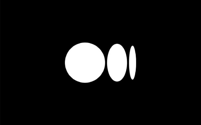
The most significant change is with the symbol:
![]()
The symbol works both colorways and certainly gives Medium more of an identity than before. Here’s why they did it:
“A symbol gives us more creative flexibility, another tool in the toolbox
Medium is a platform for creators to express themselves, so our brand should never get in the way of yours. When you read on Medium, a symbol allows Medium the brand to take a backseat to let individual publications and writers shine
The symbol, like our illustration style, is inspired by language and typography. It is born from the ellipses: a punctuation mark that represents an unfinished or impending thought, an idea to come, what’s next. This is, again, what happens on Medium - there’s always a new idea, always more to the story.”
Medium is all grown up now.
What Does The Future Hold?
It’s tough to say what the future holds. Medium recently made a ‘pivot,’ offering its editorial staff buyout. In a statement, founder Ev Williams wants to emphasize individual writers, as their in-house publications haven’t been performing as well as expected. So you can expect to see those wound down over the coming months.
There’s a sense that Medium often doesn’t know what it’s doing, as if they’re jumping from pivot to pivot. Still, it’s the best place for writers to begin their careers.
With all of these changes over the past nine years, it stands to reason we could see a different Medium logo in the future.
Let’s hope it’s a good one.